Moving forward by looking back
The Official Poster is a Wimbledon tradition dating back to the 1920s, but for a while it had lost its way. It had become too corporate, too constrained by guidelines, and its role wasn’t particularly clear. By trying to do too much, it wasn’t really doing anything.
When I joined Wimbledon as Creative Lead, I took the project on and decided it was time to give the poster its purpose back. From a brand perspective, it needed to feel unmistakably Wimbledon. From a fan’s perspective, it needed to be beautiful enough that someone would actually want to give it permanent space on their wall.


I simplified the whole process. I cut out unnecessary intermediaries and put the budget where I thought it mattered most, finding great artists and paying them properly.
I’d usually start with around ten artists, narrow that down to three, then commission paid tests from each. Everyone got the same brief, but I’d spend a few hours with each artist talking through Wimbledon, the brand and what made the Championships special, so they had enough context to do their best work.
We kept the first stage deliberately rough. Sketches over polished execution, so all the energy went into finding the strongest idea first. From there, I selected the artist, got alignment from senior stakeholders including our CEO and Chair, then worked closely with them to craft the final piece and take it through production.
The approach was better for the artists, better for the work and ultimately better for Wimbledon.


2022
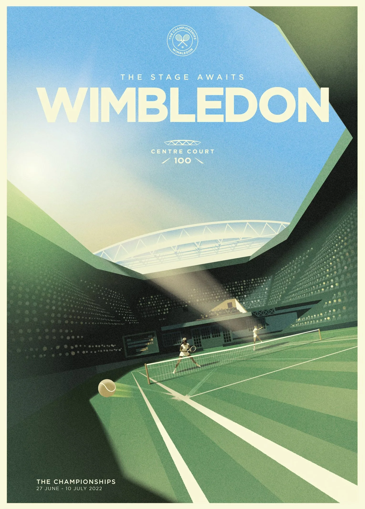
Centre Court turned 100 in 2022, so the poster became a celebration of one of the most iconic venues in the sporting world. Mads Berg focused on the court itself, capturing its scale, drama and sense of occasion.
The result felt so right for the year that his visual language ended up shaping the wider centenary campaign too.


2023
Eric van den Boom packed the artwork with some of Wimbledon’s most recognisable details, from strawberries and trophies to umpire chairs, Boston Ivy and Rufus the hawk.
The result was full of little “easter eggs” for fans to discover, turning the poster into something that rewarded a closer look while still feeling unmistakably Wimbledon.


2024
Bella Grace took some of Wimbledon’s most recognisable tennis details and used them to build flowers synonymous with the Championships. Those flowers then come together to form the two trophies, creating an artwork with multiple layers to discover and an incredible level of craft.
The piece went on to become a 20-metre hand-painted mural and inspired one of our best-selling retail collections.


2025
Sarah Madden leaned into one of Wimbledon’s most distinctive contrasts: world-class tennis happening in what can sometimes feel more like an English garden.
The crowd disappears into hydrangeas, petunias, butterflies and bees, creating something that feels both very Wimbledon and completely unexpected.
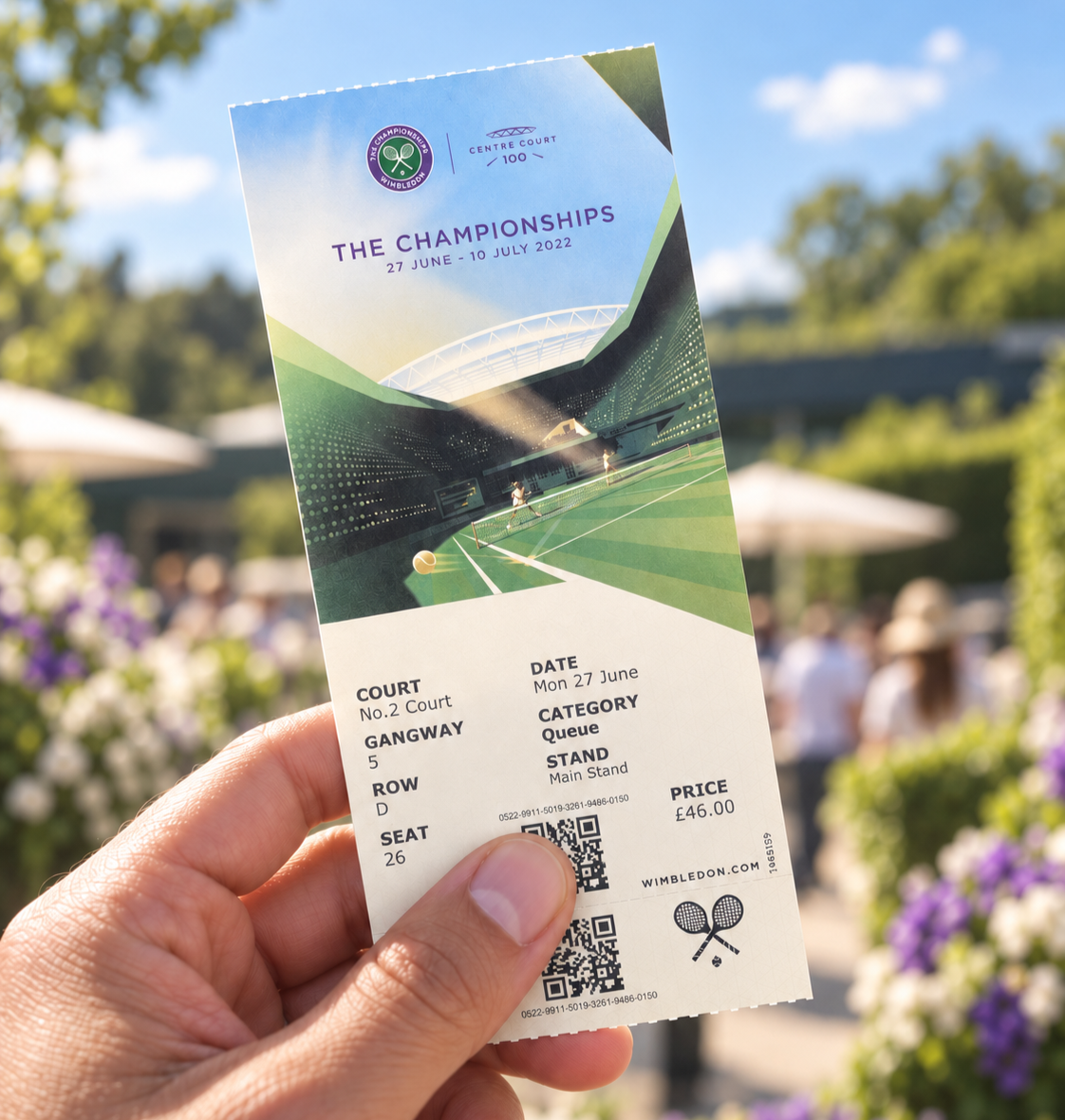
What had once been a slightly neglected tradition became one of the visual pillars of the Championships each year. The artwork started appearing across posters, tickets, programmes, hero spaces around the Grounds and OOH, creating a much more consistent visual thread through the whole event.
It worked commercially too. The artwork became the basis of retail collections that performed really well, giving the poster a life beyond the Championships and turning it back into something people wanted to buy, collect and keep.